Context
Vet À Domicile is a home-based veterinary service focused on providing care for pets directly at home, reducing stress for both animals and their owners. By shifting the point of care from clinics to the home environment, the service inherently communicates proximity, trust and emotional sensitivity.
Vet À Domicile is a home-based veterinary service focused on providing care for pets directly at home, reducing stress for both animals and their owners. By shifting the point of care from clinics to the home environment, the service inherently communicates proximity, trust and emotional sensitivity.
However, the visual identity did not fully reflect this positioning. As the service matured, there was a growing gap between what the brand delivered in practice and how it presented itself visually. The identity needed to evolve to better express its values while supporting a more contemporary and consistent presence across different touchpoints.
Challenge
The existing identity no longer reflected the quality and nature of the service.
The existing identity no longer reflected the quality and nature of the service.
- Outdated visual language with limited expressiveness
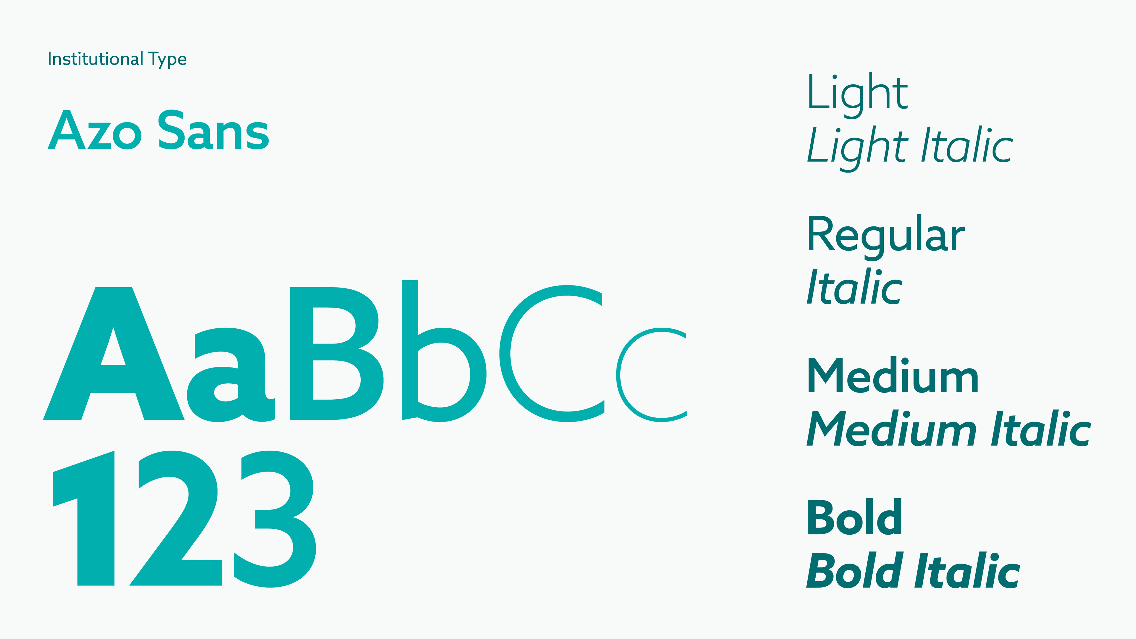
- Neutral typography lacking personality and warmth
- Underutilized brand assets with low system flexibility
- Neutral typography lacking personality and warmth
- Underutilized brand assets with low system flexibility
The challenge was not only to modernize the brand, but to redefine how it communicates care, accessibility and trust through a more coherent and scalable visual system.

My Role
I worked on the redesign of the visual identity, with a focus on translating the brand’s values into a more expressive, flexible and consistent system that could adapt across both physical and digital contexts.
I worked on the redesign of the visual identity, with a focus on translating the brand’s values into a more expressive, flexible and consistent system that could adapt across both physical and digital contexts.
- Visual identity redesign
- Typography and color system definition
- Exploration of graphic elements and layout applications
- Typography and color system definition
- Exploration of graphic elements and layout applications
Key takeaway: Even relatively simple brands benefit from being approached as systems, where consistency and flexibility enable long-term evolution.
Process
The process started with a careful analysis of the existing identity, identifying which elements carried recognition and should be preserved, and which aspects were limiting the brand’s ability to evolve.
The process started with a careful analysis of the existing identity, identifying which elements carried recognition and should be preserved, and which aspects were limiting the brand’s ability to evolve.
- Identified core recognizable elements of the brand
- Evaluated limitations in typography, color and composition
- Explored directions to increase warmth, clarity and flexibility
- Evaluated limitations in typography, color and composition
- Explored directions to increase warmth, clarity and flexibility
Rather than proposing a disruptive change, the goal was to evolve the brand in a way that felt natural and recognizable, while introducing enough transformation to reposition it for the future.
Solution
The redesign was built around balancing continuity and evolution, strengthening the emotional and visual qualities of the brand while creating a more structured system.
The redesign was built around balancing continuity and evolution, strengthening the emotional and visual qualities of the brand while creating a more structured system.
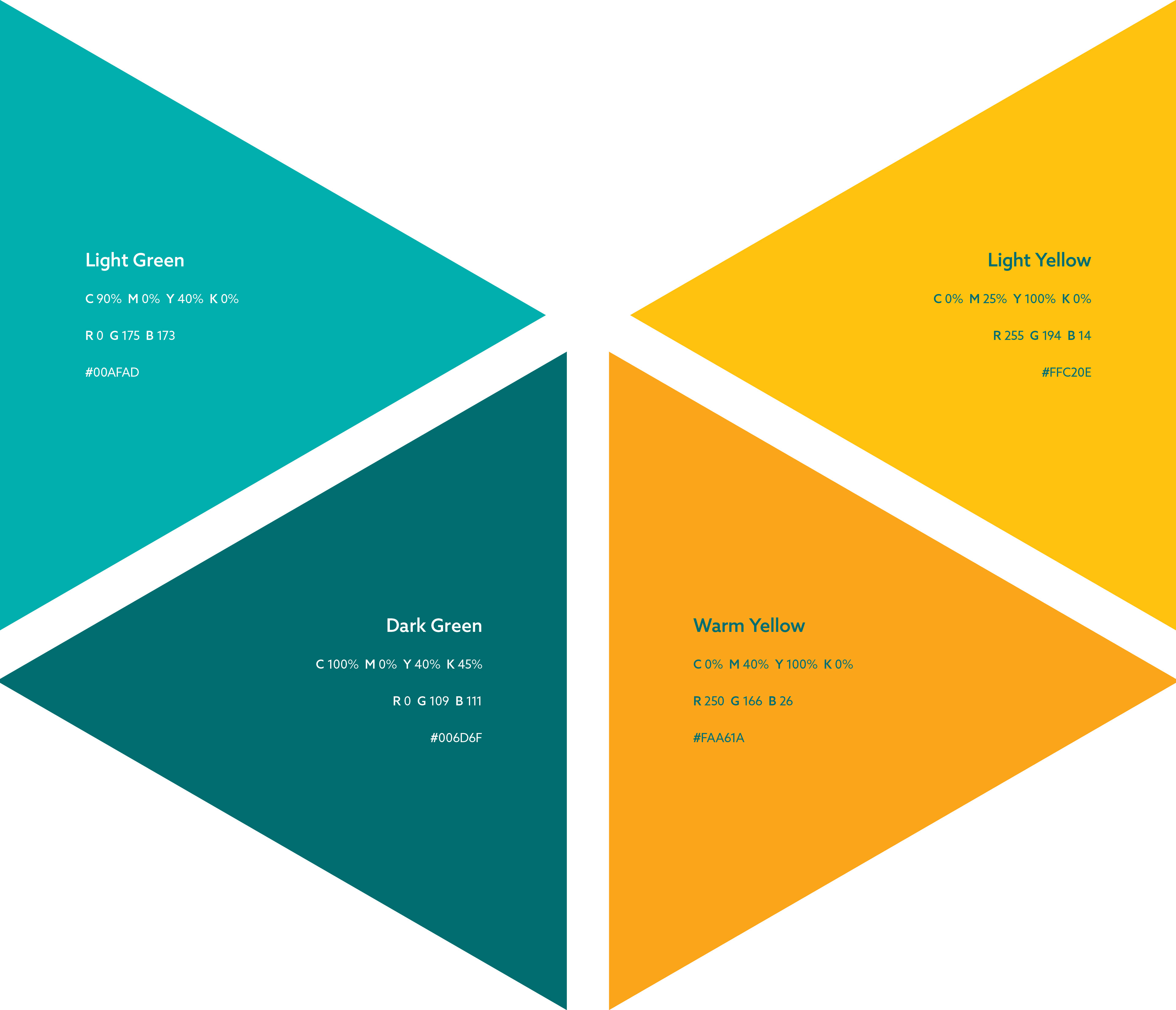
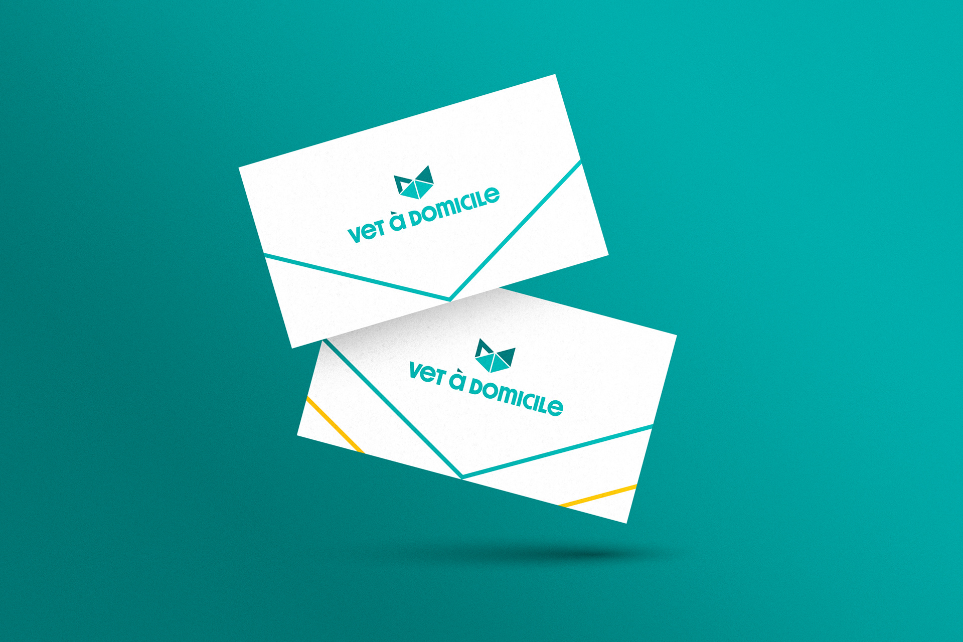
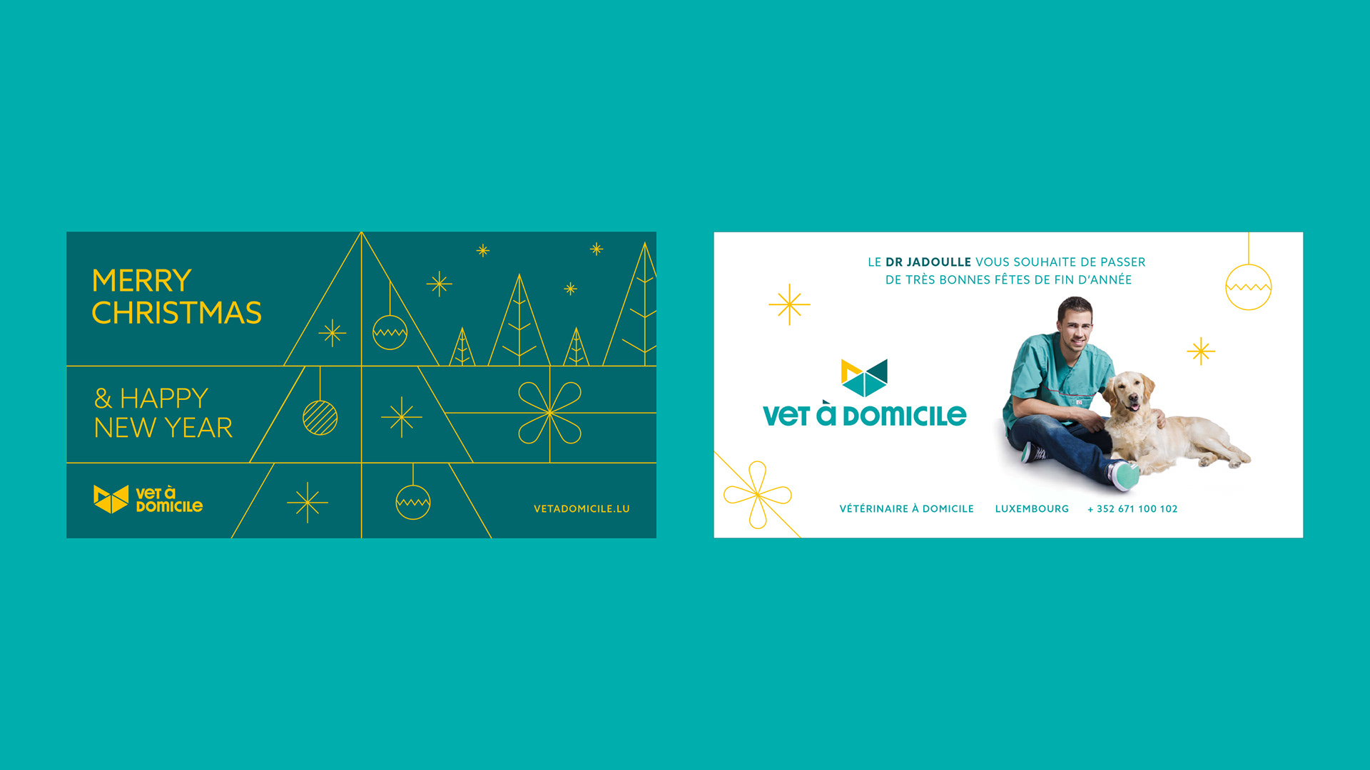
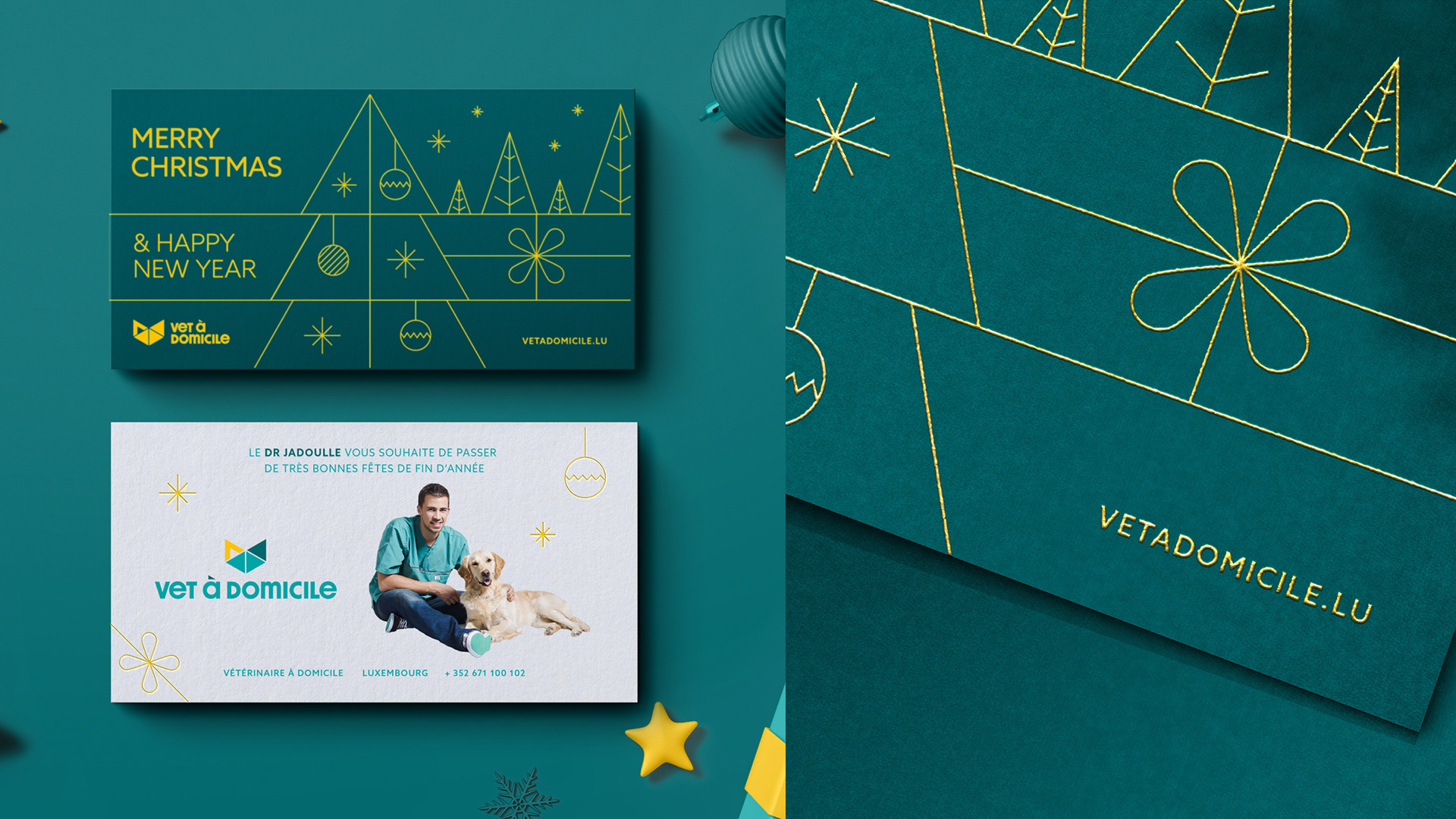
- Updated color palette with more vibrant tones and the introduction of yellow as a secondary warm color
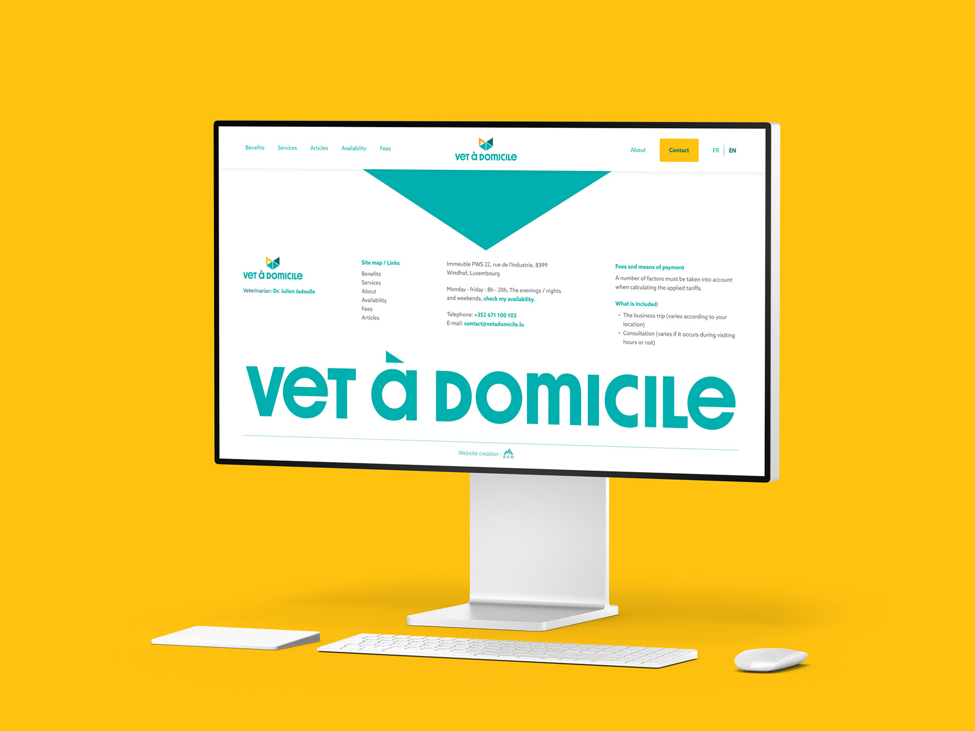
- Replaced the previous uppercase typography with a more distinctive lowercase typeface, increasing proximity and empathy
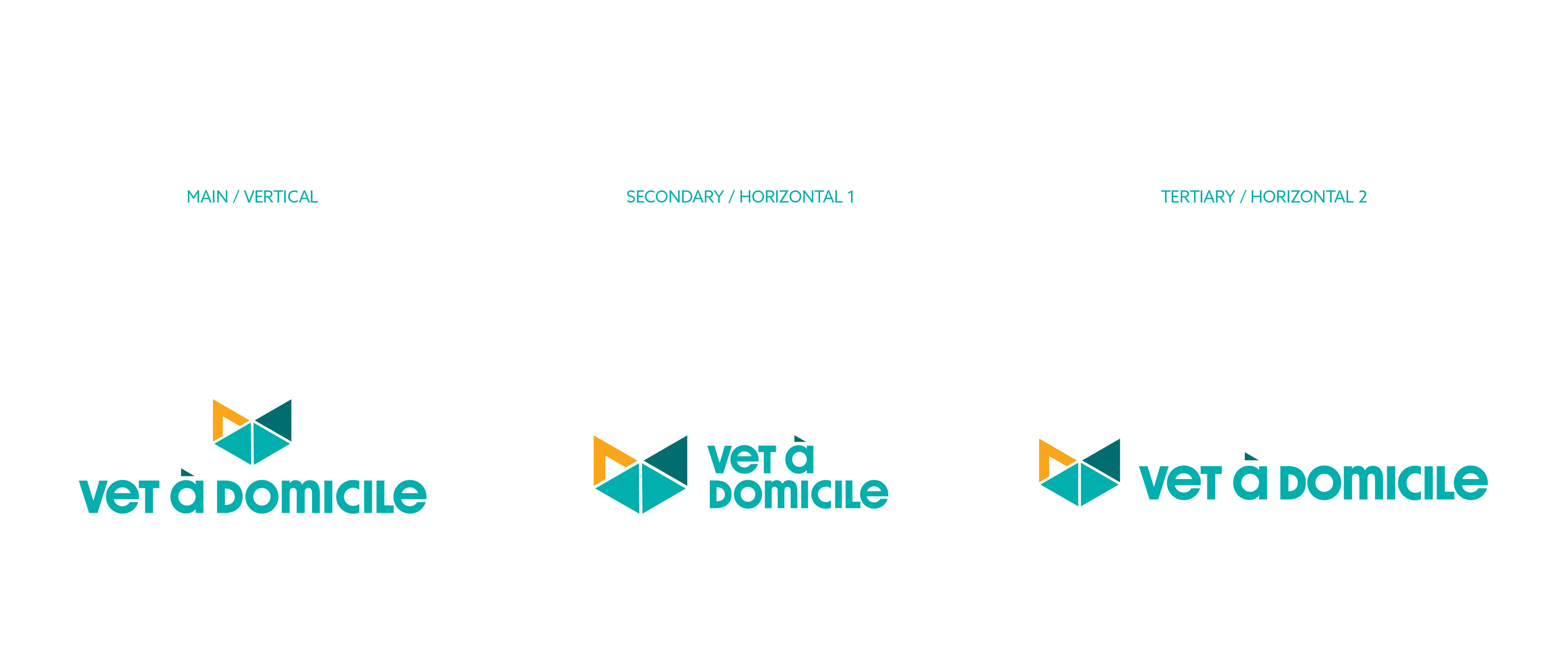
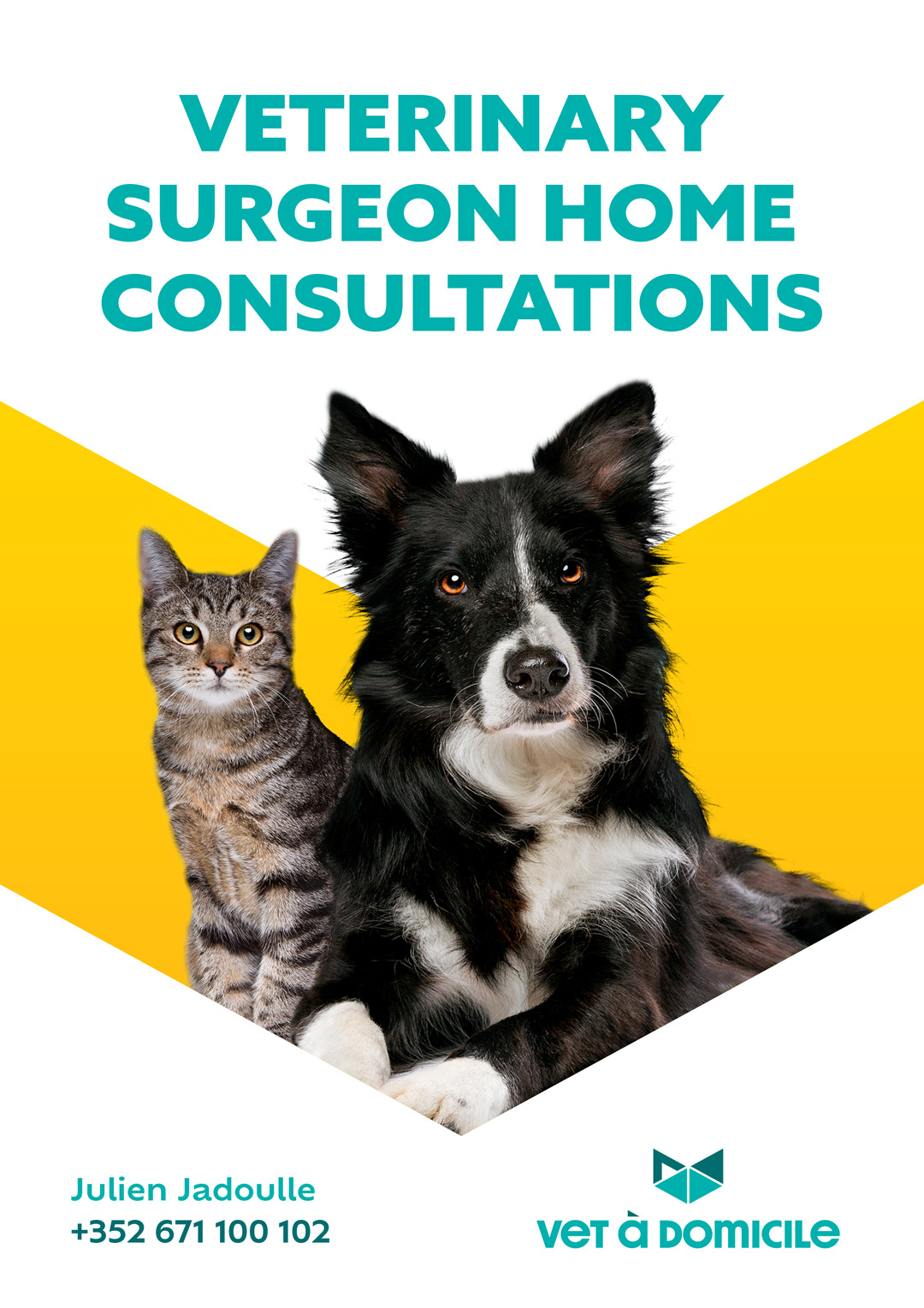
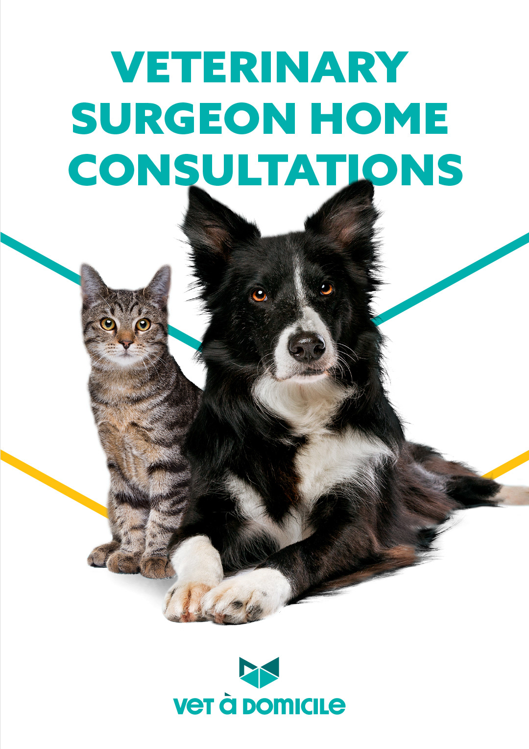
- Transformed the “V” shape from the original logo into a central graphic element
- Replaced the previous uppercase typography with a more distinctive lowercase typeface, increasing proximity and empathy
- Transformed the “V” shape from the original logo into a central graphic element
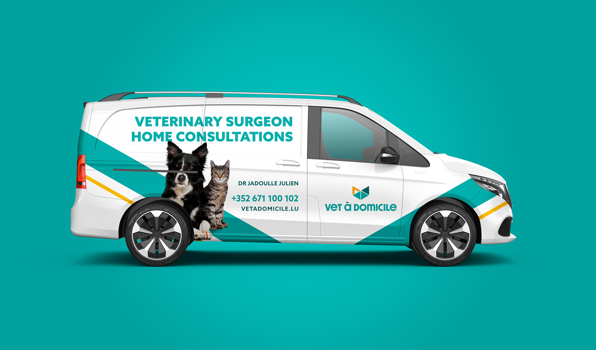
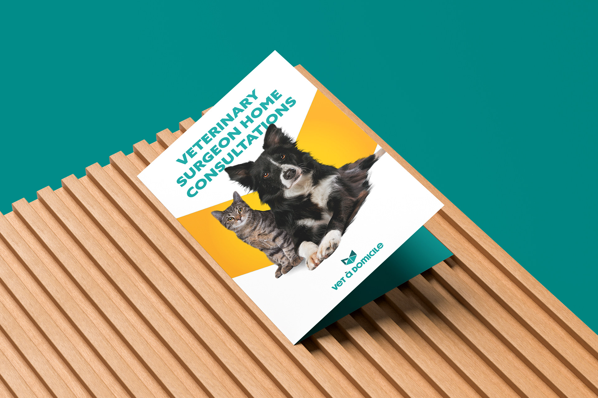
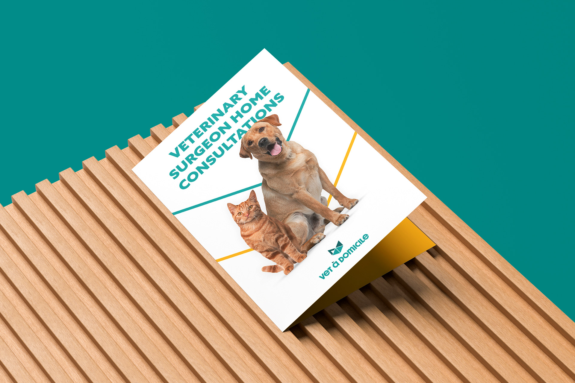
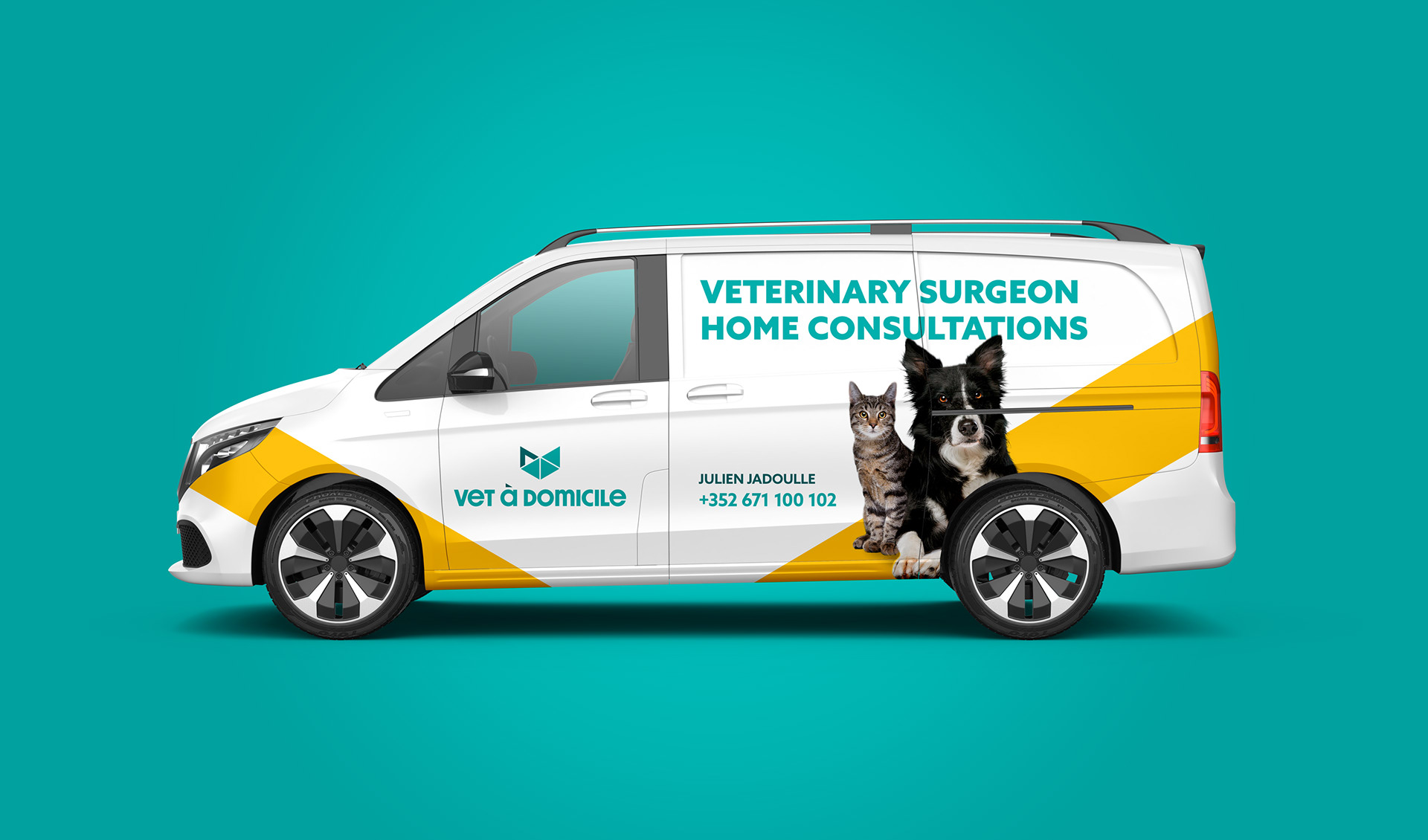
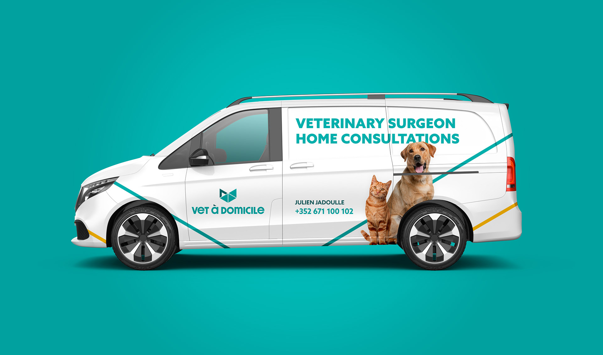
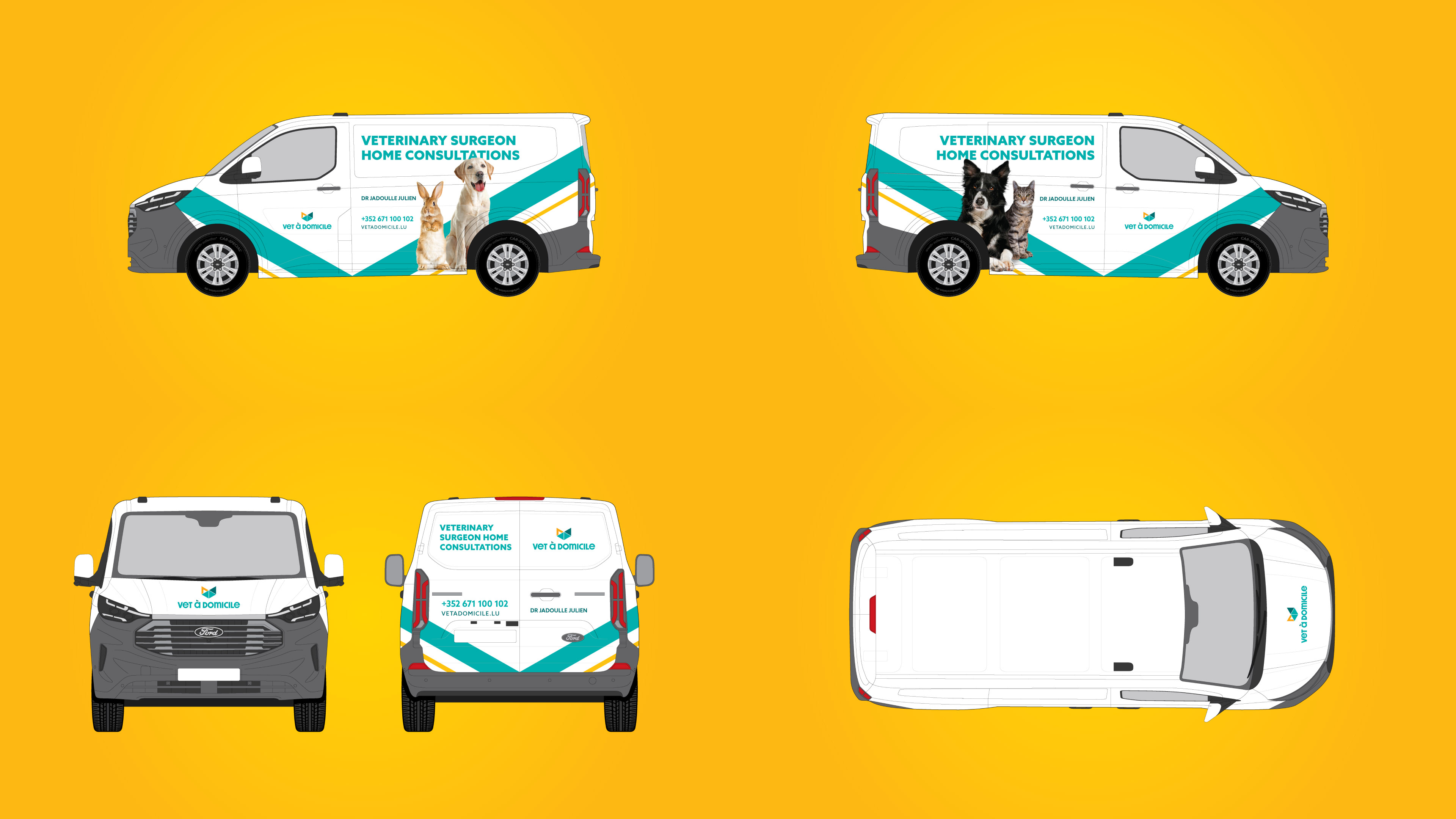
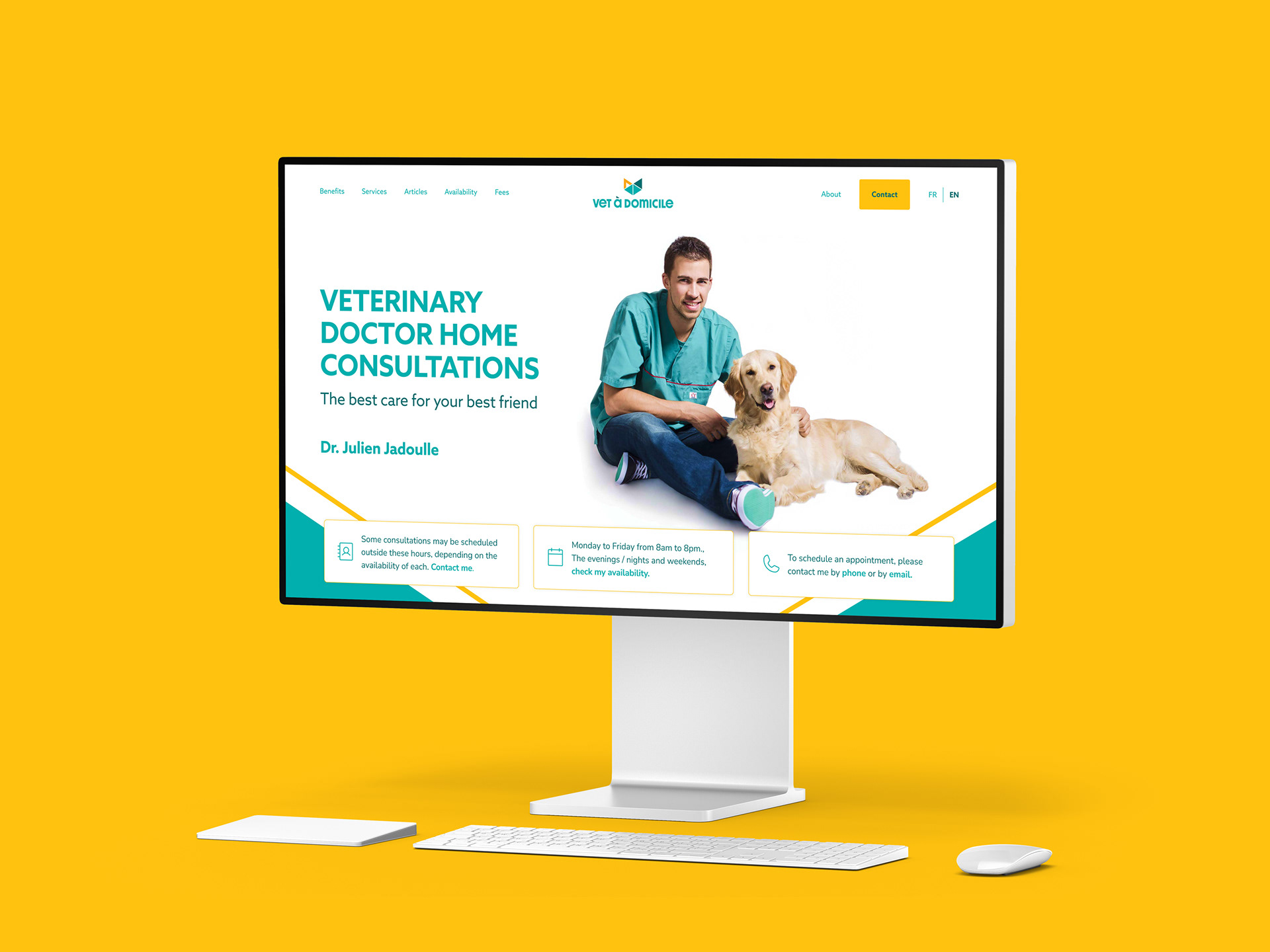
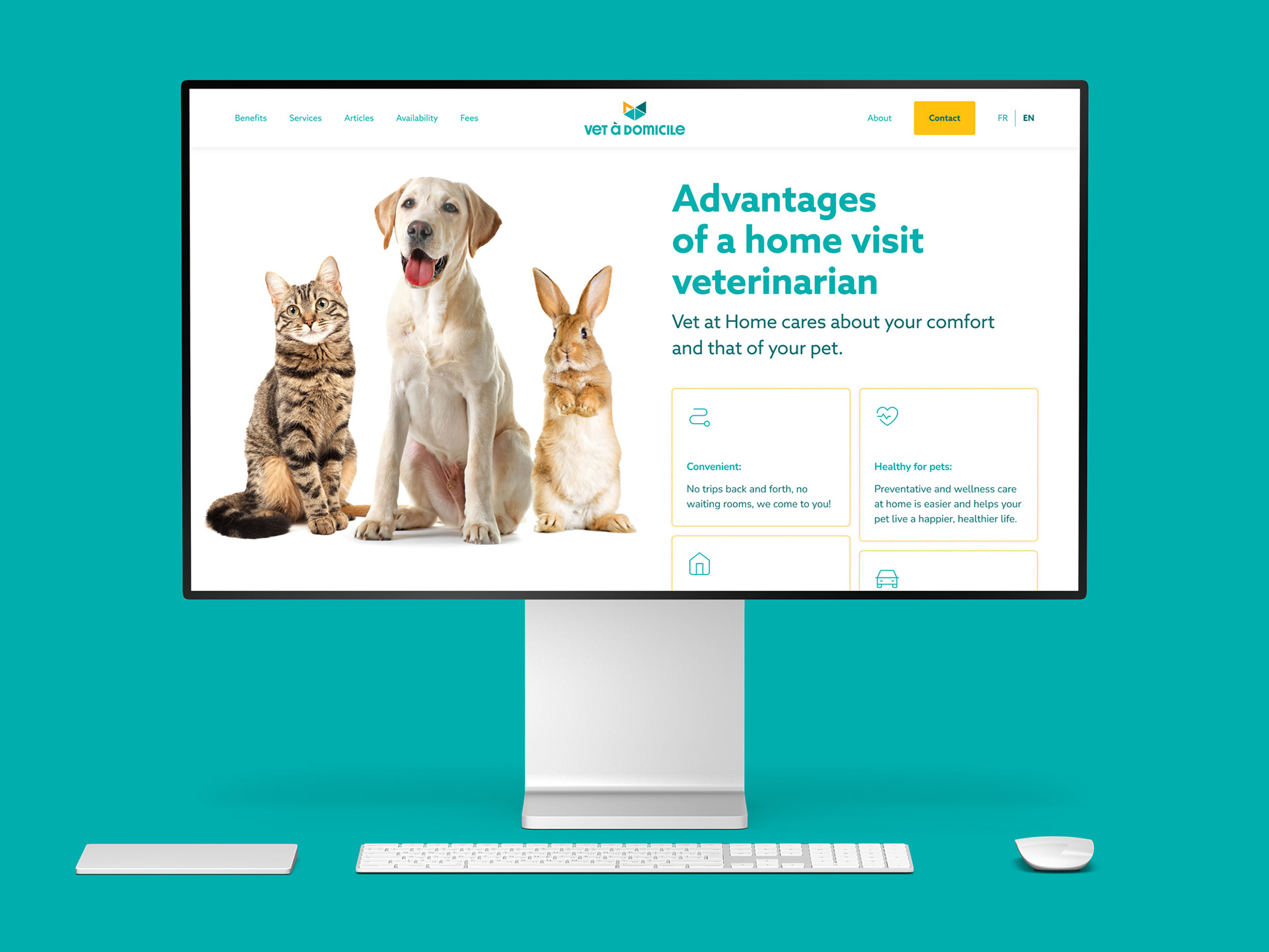
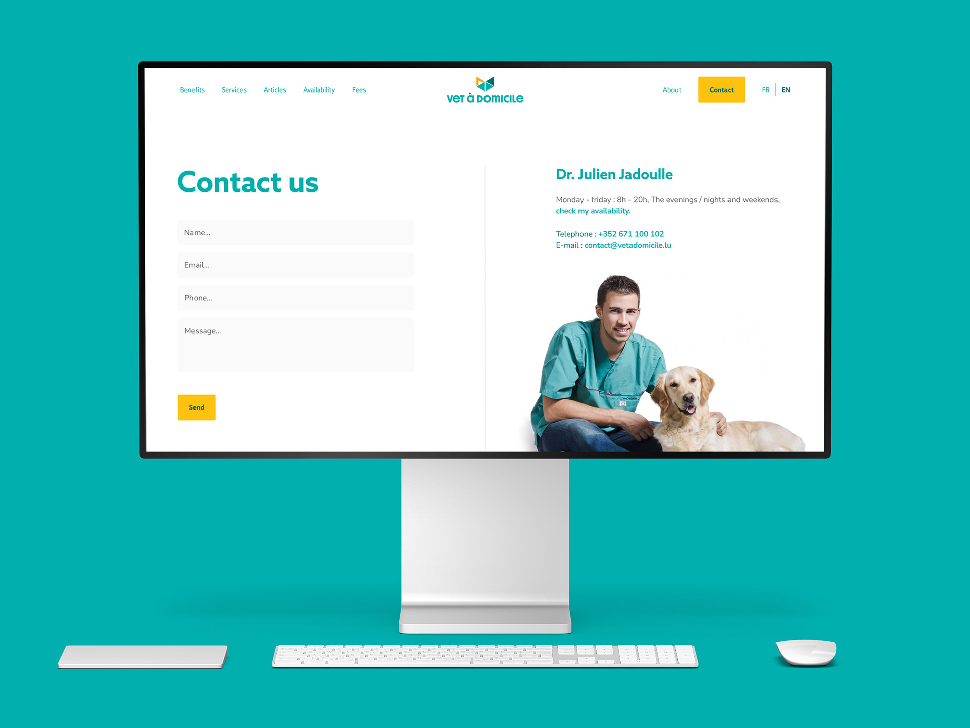
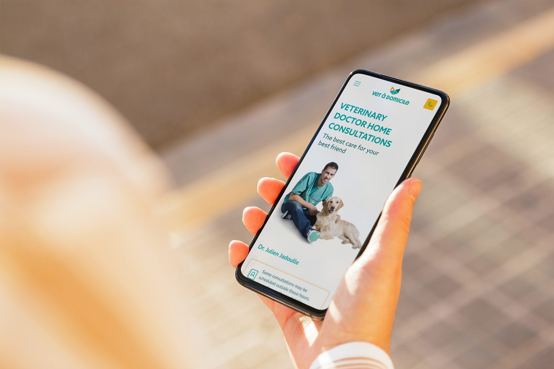
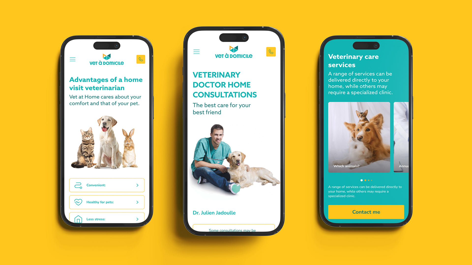
This element became the foundation of a flexible visual system, applied consistently across stationery, vehicle branding and digital interfaces, enabling a cohesive brand experience across different contexts.
Outcome
The result is a visual identity that feels more aligned with the service it represents—more human, more approachable and more contemporary.
The result is a visual identity that feels more aligned with the service it represents—more human, more approachable and more contemporary.
- Stronger visual recognition through a cohesive system
- Increased sense of proximity and accessibility
- Greater flexibility across physical and digital applications
- Increased sense of proximity and accessibility
- Greater flexibility across physical and digital applications
The brand now operates as a system rather than a collection of isolated elements, allowing it to scale and adapt while maintaining consistency and recognition.
Credits: BAMHUB